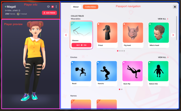
Based on the product requirement of a new passport to enhance the users interactions, here
follows the initial Technical Assessment. Listing the different functionalities required and
the teams involved in the development.
Context, Reach & Prioritization
The current passport functionality is not as useful as it could be, it lacks functionalities
and usability. A new design has been created to enhance and transform the previous passport in
a new multi-tab panel, that integrates the previous functionality and adds new ones.
Solution Space Exploration
In order to integrate this new passport we will need a FeatureFlag to choose between the old
passport flow and the new one. The new panel will be logically divided in 3 sub-panels:
Player info: the upper part of the left side
Player preview: the render of the player, with the possibility of rotating around the
visuals
Player navigation: the right part, a tab system with different panels
Each part will work independently from the others, with parallel loading spinners in order to
provide as soon as possible any loaded infos from the user.
To achieve this a main Controller/View of the entire panel will follow the old flow of the
passport opening to obtain user informations, and will then share this informations to the sub
panels. The specific processing of this infos will be done by the sub-panels controllers, i.e.
the user data will be sent to the player info panel, its controller will be the one in charge
of filtering the name if the profanity filter is enabled. This will allow us to easily extend
the passport in the future.
Specification
Player info
The majority of info displayed in the player info are already available in the old integration
of the passport, what is missing is:
Showing how many friends a user has
Showing mutual connections
Copying and displaying the address
Showing how many friends a user has
This information needs to be provided by the backend, it is something not yet integrated. The
simples approach would be to include the user friends count in the current flow meaning:
Unity renderer will add the friends count to the user data structure
Kernel will add the friends count in the payload of the
AddUserProfileToCatalog request
Platform will provide the friends count in the user request
Showing mutual friends
A number with mutual connections will be presented along with a limited amount of profile
pictures (5 or 6 based on the available space). Same as showing how many friends a user has,
this feature should be integrated at different levels:
Unity renderer will add the number of mutual friends and a list of profile pics to the user
data structure
Kernel will add the mutual friends count in the payload of
AddUserProfileToCatalog request
Platform will provide the mutual friends in the user request
The simplest scenario would be to provide in the User data the number of mutual friends and a
list of pictures.
Copying the address
This functionality will be made entirely by the unity renderer by creating an invisible button
containing the address and functionality to copy on each click
Player
preview
The player preview panel is an interactive area where the preview of the player is shown and
can be rotated. There are different approaches to obtain this result:
Use a render texture as in the backpack
Visualise directly the 3d model
If adopting the render texture solution we need to keep in mind that, like in the backpack
player preview, some post processing effects cannot be applied due to technical restrictions
of the render textures.
Player preview loading
Because the player preview will need to load and won’t be available immediately on the
passport open we will need to integrate the hologram system even here. The best approach would
be to have a new variation of the PlayerPreview just made for this scenario.
If a player we are inspecting changes wearables while their passport is open we won’t reflect
the change immediately but just at the new passport opening.
Passport navigation
The passport navigation will be initially divided in the two following tabs
About tab
Here the intro will be the same shown in the current passport. Links that have been listed at
the end of the description will be listed in the second part. Links that were written in the
middle of the description will appear in the middle of the description.
Currently in the User structure we have the list of equipped wearables that we can use to show
the equipped wearables.
Collections tab
For the collections tab we will have different sections per category if the user has any item
of the respective category:
Wearables: we already have the list of wearables to display in the AvatarModel
Emotes: we already have the list of emotes to display in the AvatarModel
Names: we require a new flow to obtain the user owned names (a new lambda similar to the
wearables owned by user and the kernel messaging to unity)
Lands: we require a new flow to obtain the user owned lands (a new lambda similar to the
wearables owned by user and the kernel messaging to unity)
From the Unity point of view it would make sense to create two new catalogs in the
CatalogController , one for the owned lands, one for the owned names.
With this structure in action we could add to the AvatarModel definition two more
lists of strings for the names and lands.
Kernel could call two new functions in line with the AddWearablesToCatalog that
could be AddLandsToCatalog and AddNamesToCatalog (if any).
For the class defining NFT Names we will need:
name (subdomain)
contract address (in order to open the correct page on the market)
token id (in order to open the correct page on the market)
icon (?)
For the class defining Lands we will need:
contract address (in order to open the correct page on the market)
token id (in order to open the correct page on the market)
coordinates
name
icon
type (?)
Considering the possibility of users owning thousands of wearables/emotes we should use
pagination. Because even with paginations there might be too many wearables the idea is to
show the dots representing pages only if there are less than 10 pages, above 10 pages the dots
are not visible and the interaction can be done only with left and right arrows.
Profile card changes
The profile card will change from a graphical point of view.
For the link functionality the format will be [text](link) or a plain link, those
links will appear in the description and will be clickable. Plain links will be shown with a
text corresponding to the link domain. There won’t be any link validation because any time a
link is clicked, a popup will make sure the user intends to move to that external link,
showing the full URL.
Guest view of the passport
Guest users will not provide all the info and panels, but just a limited set. This will
require an integration just at unity level, disabling all the unwanted panels and creating
this panel variation.